
70th anniversary celebration of Cinematheque institution
Celebrates the invaluable value of the Portuguese heritage and its visual importance, especially for the new generations
Celebrates the invaluable value of the Portuguese heritage and its visual importance, especially for the new generations
Portuguese cinema of the "golden age" in Portugal = Approximation of target audience young and young-adult
- link an emotional connection
- remember an emotional connection (created by your parents)
- remember an emotional connection (created by your parents)
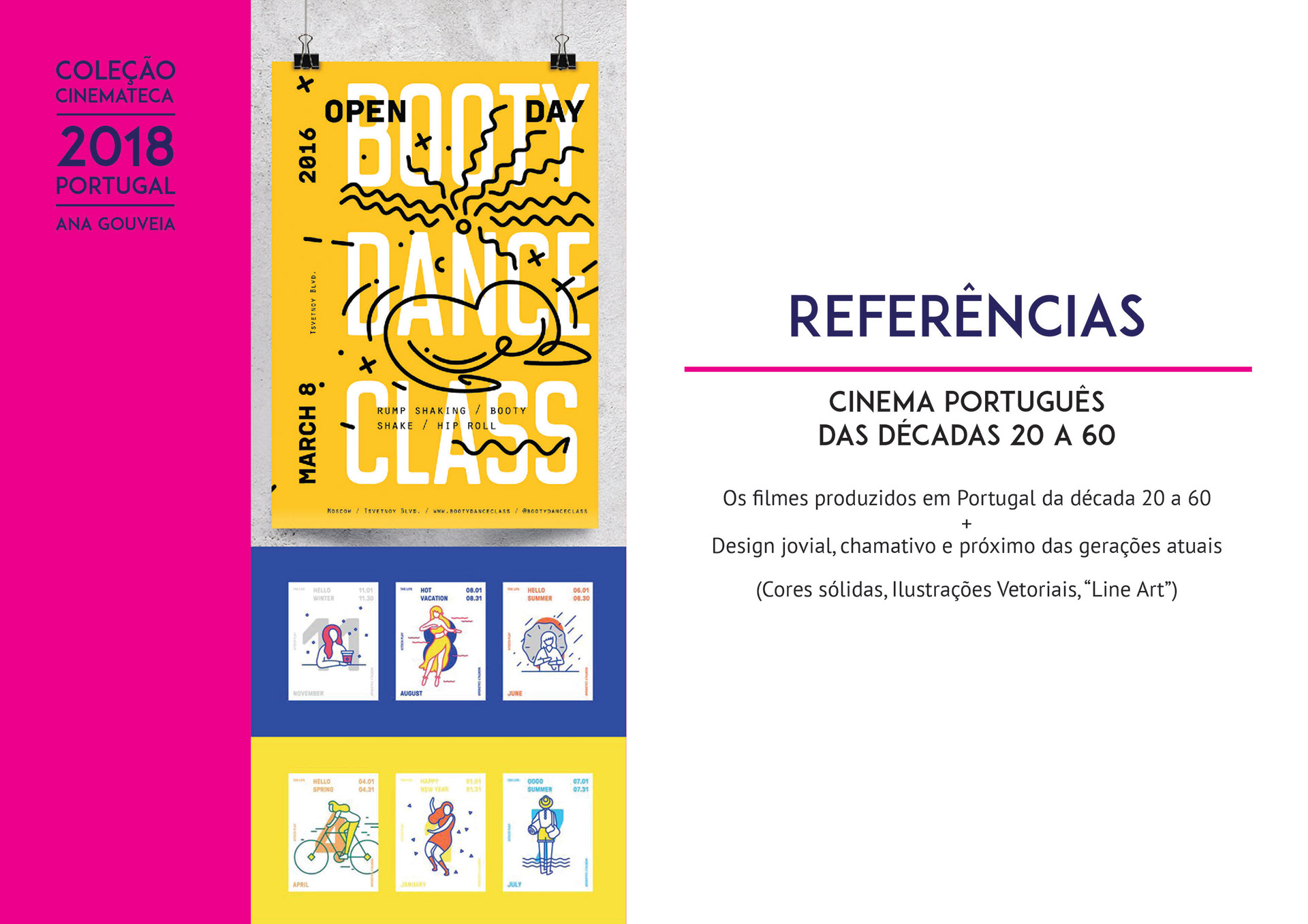
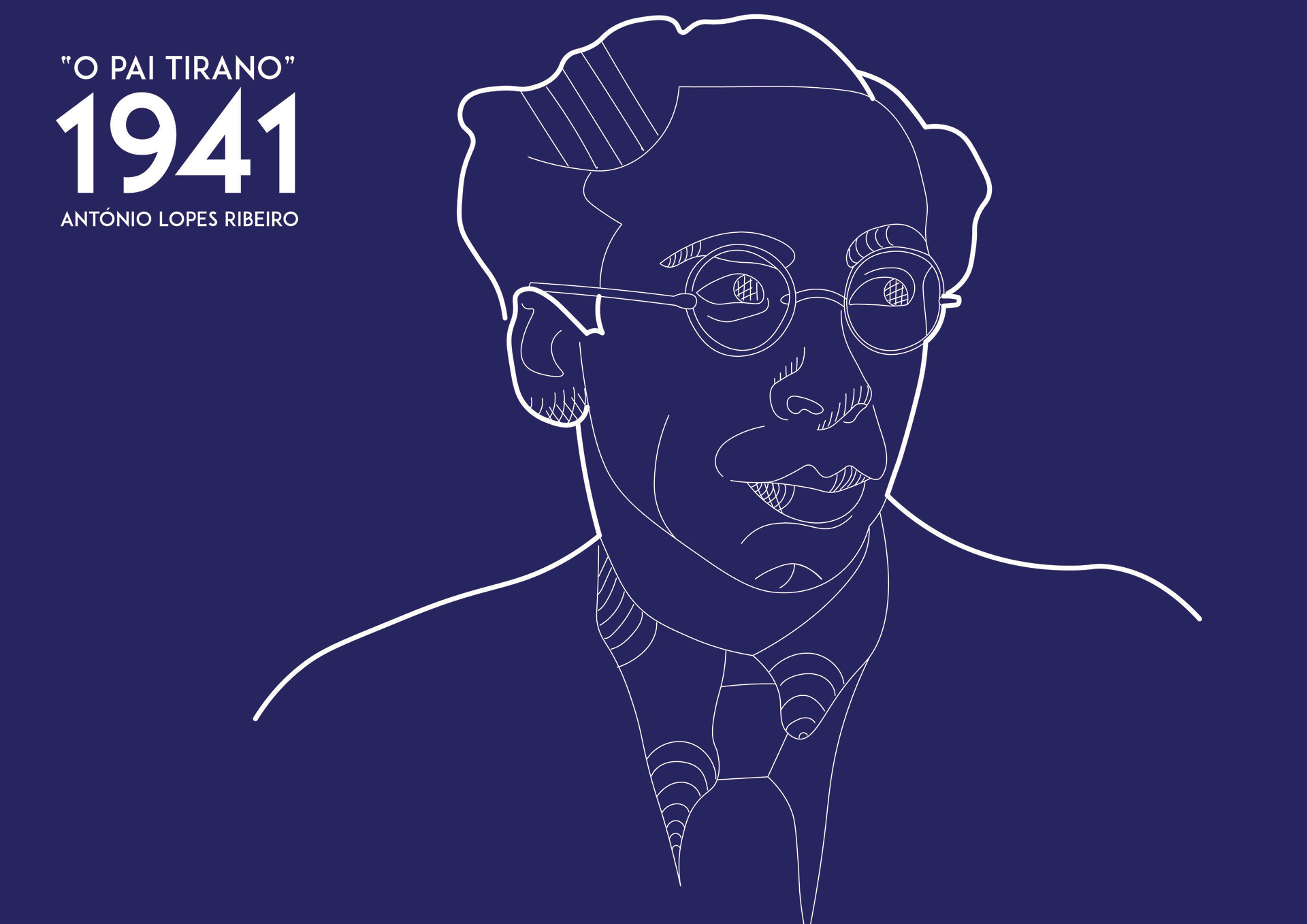
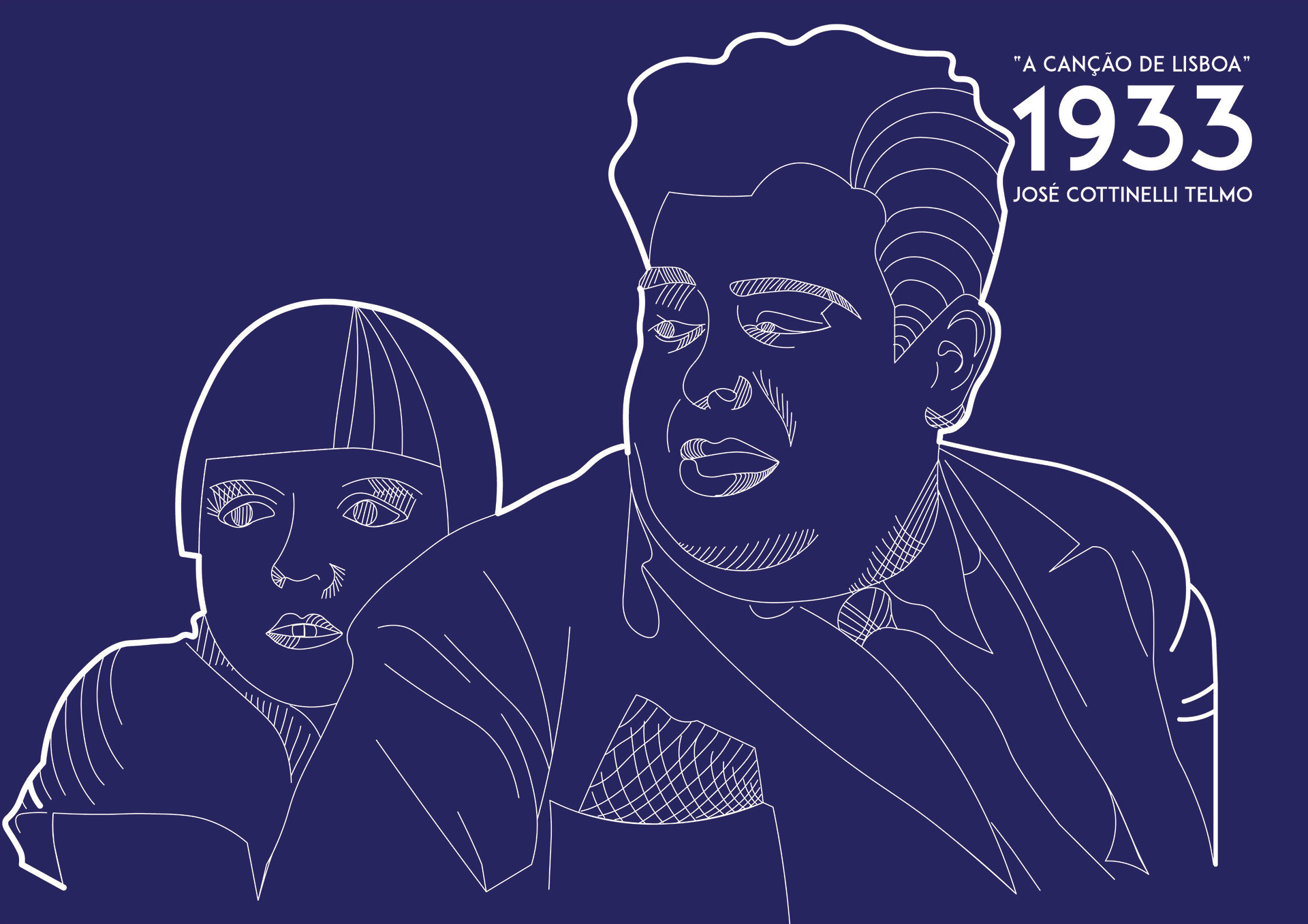
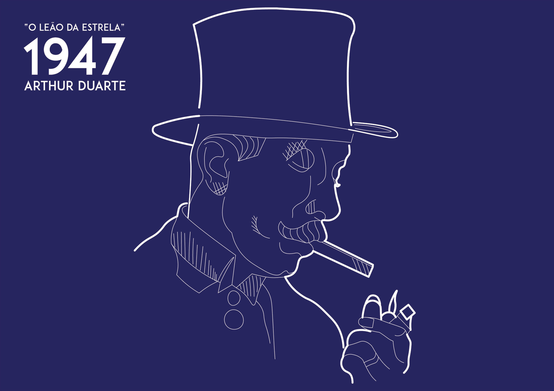
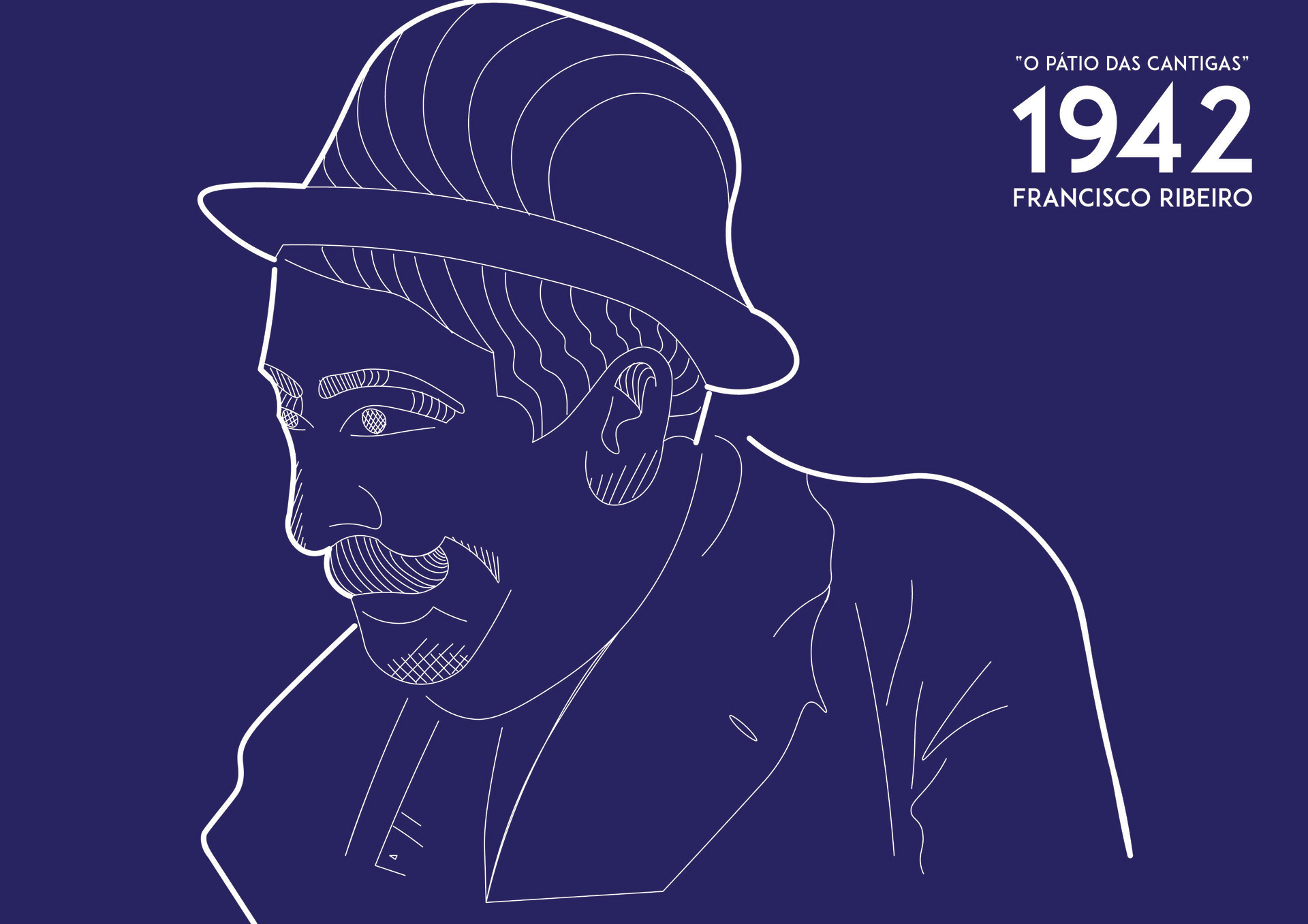
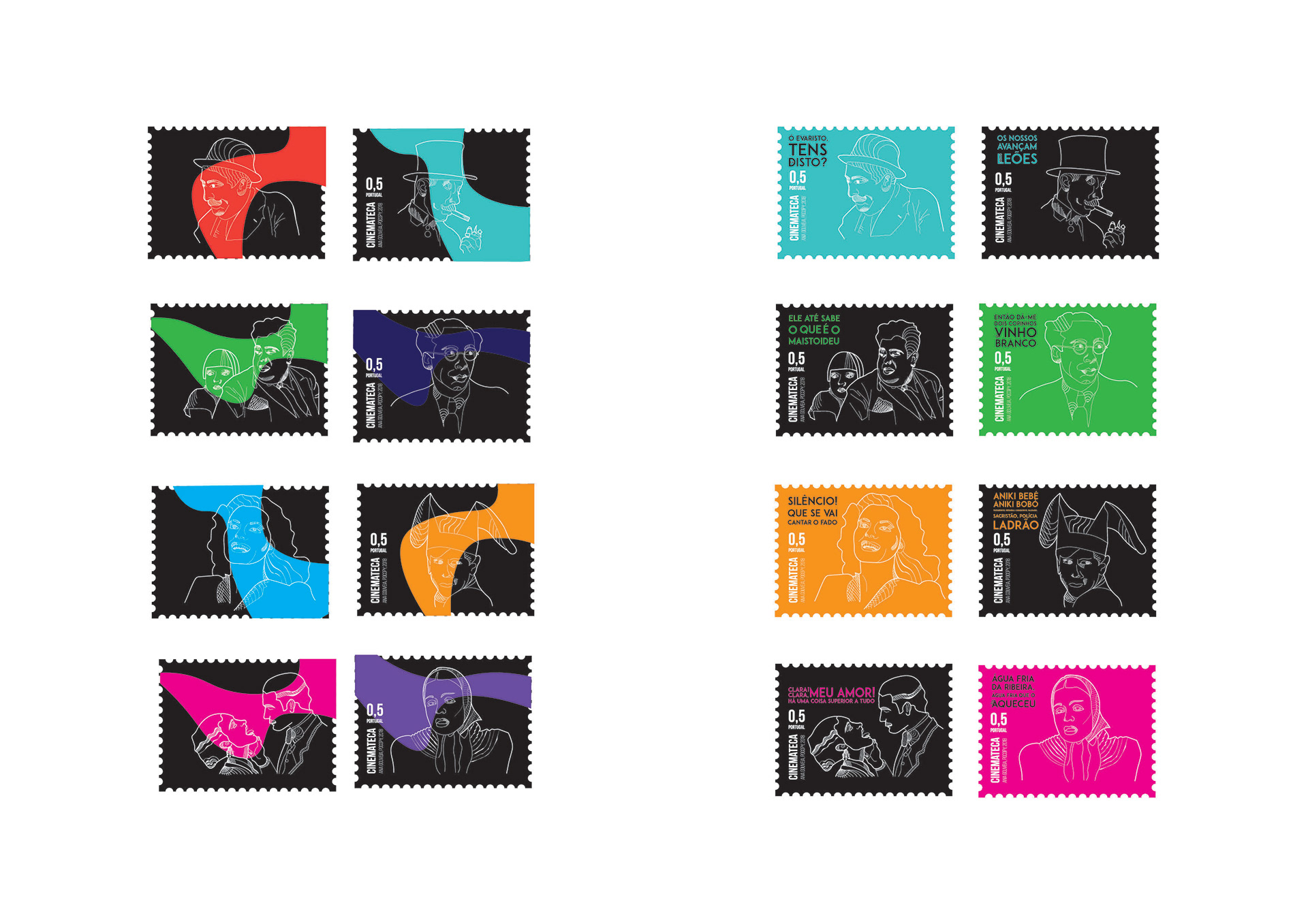
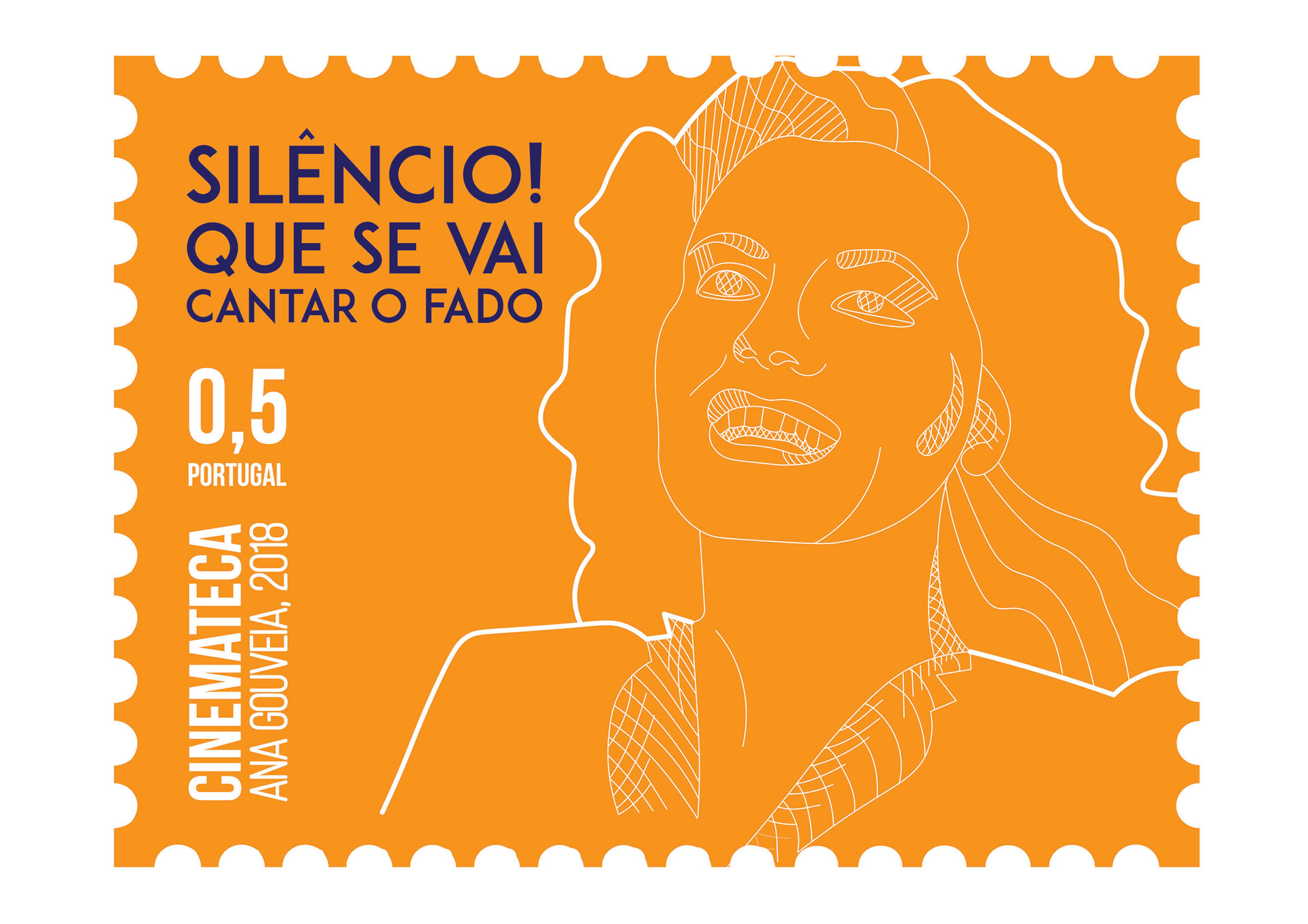
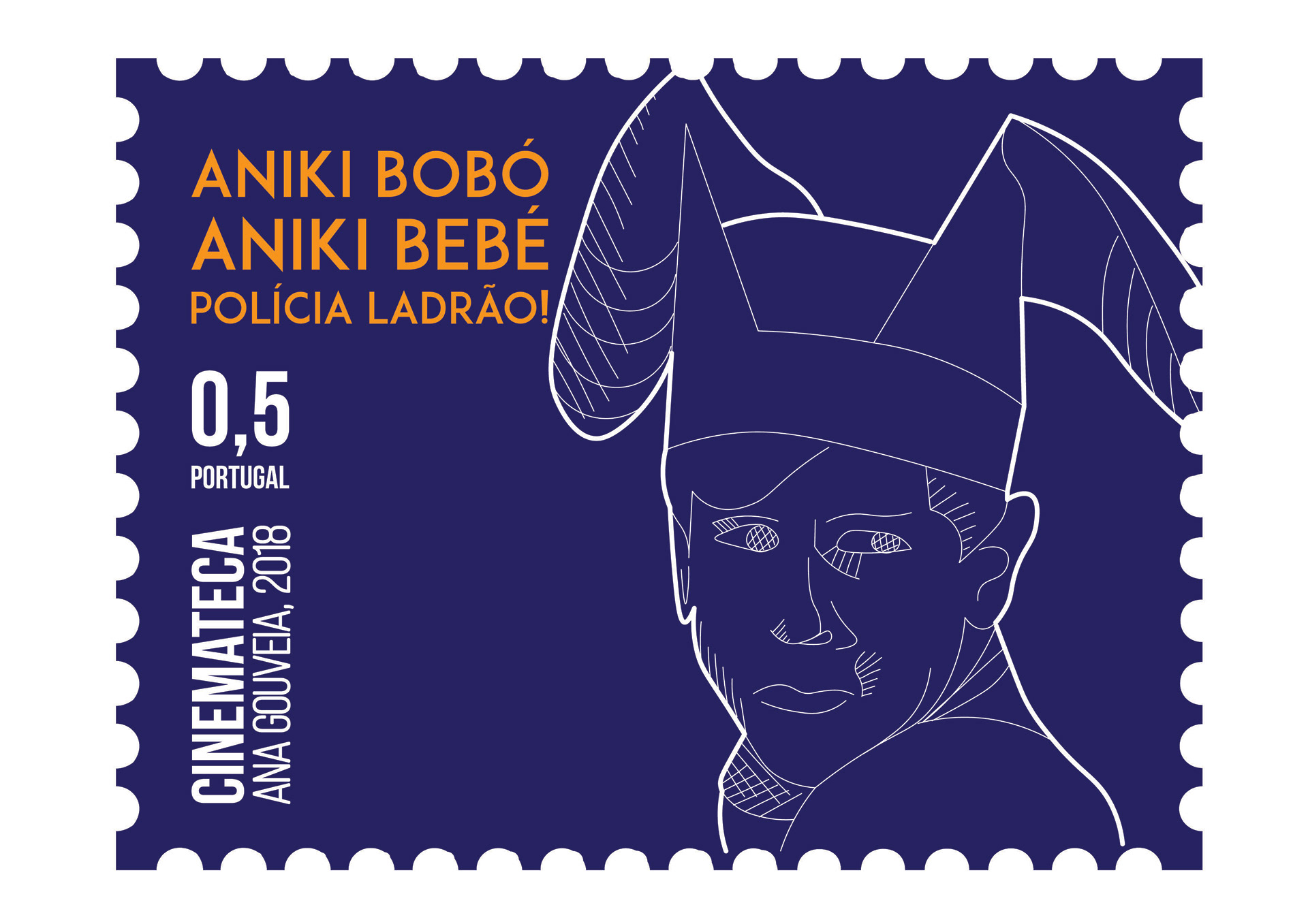
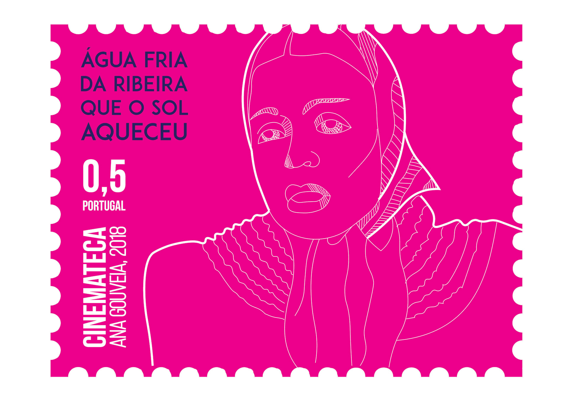
The films produced in Portugal from the 20's to 60's + Jovial aesthetics, flashy and close to the current generations
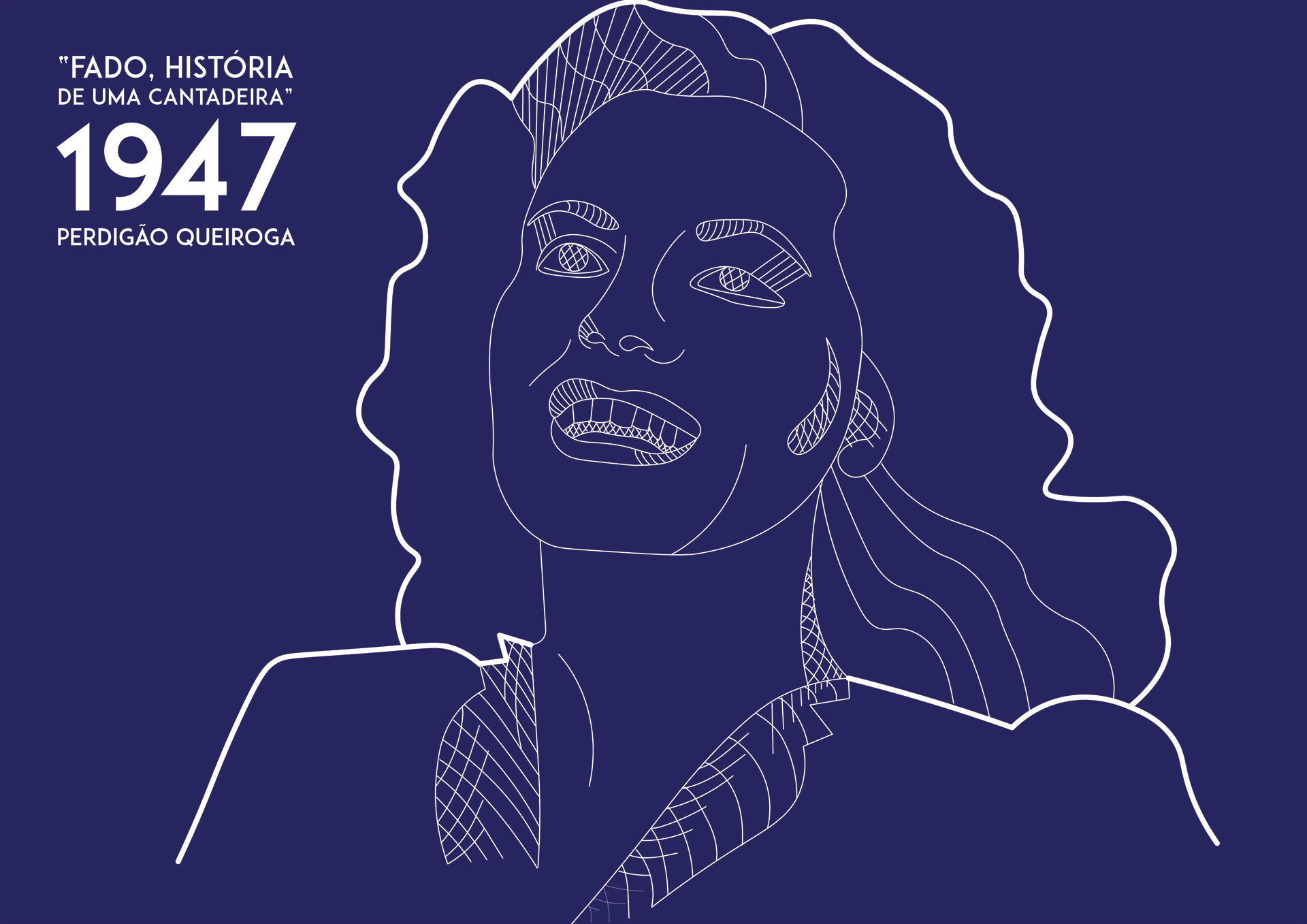
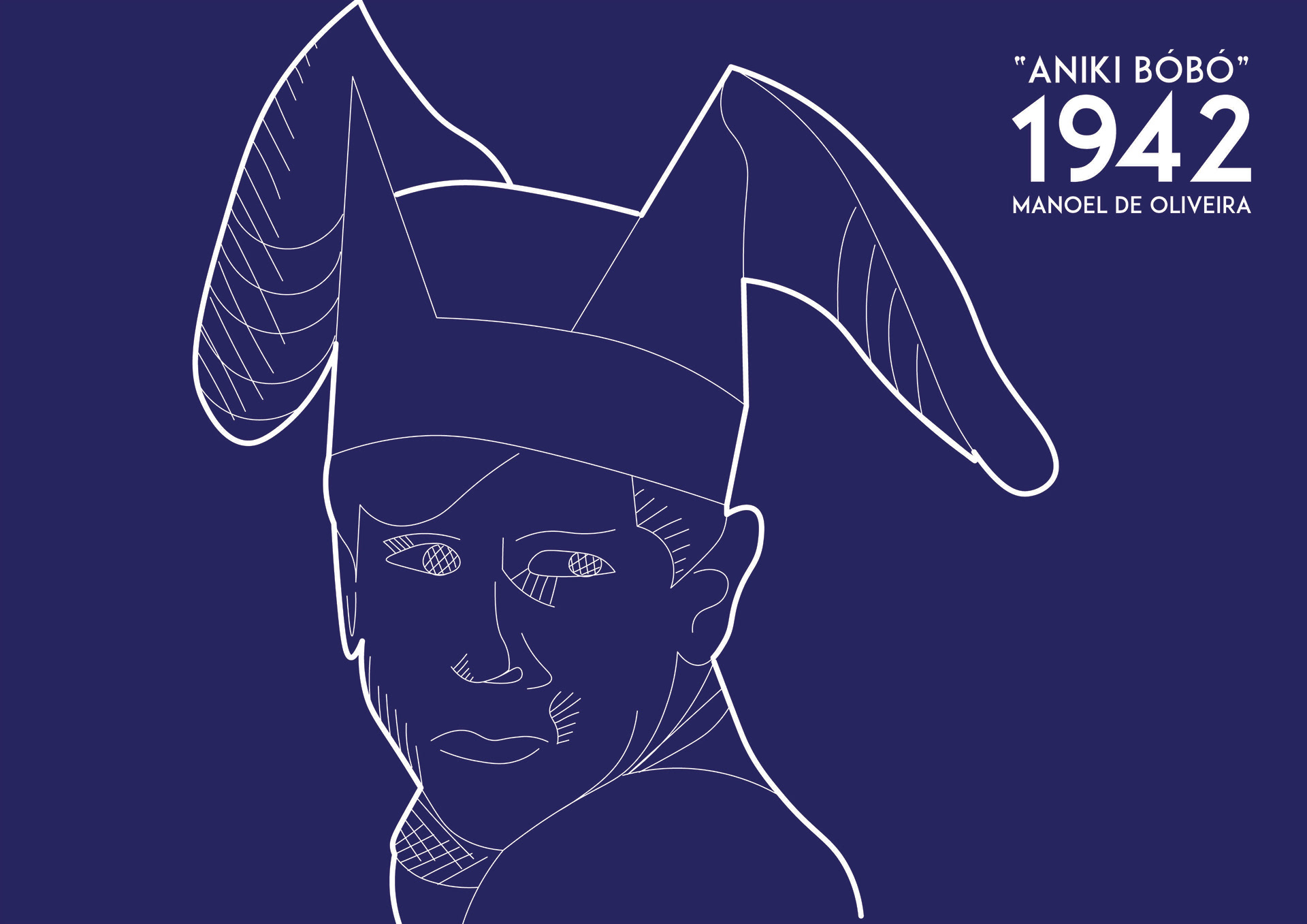
(Solid Colors, Vector Art, Line Art)
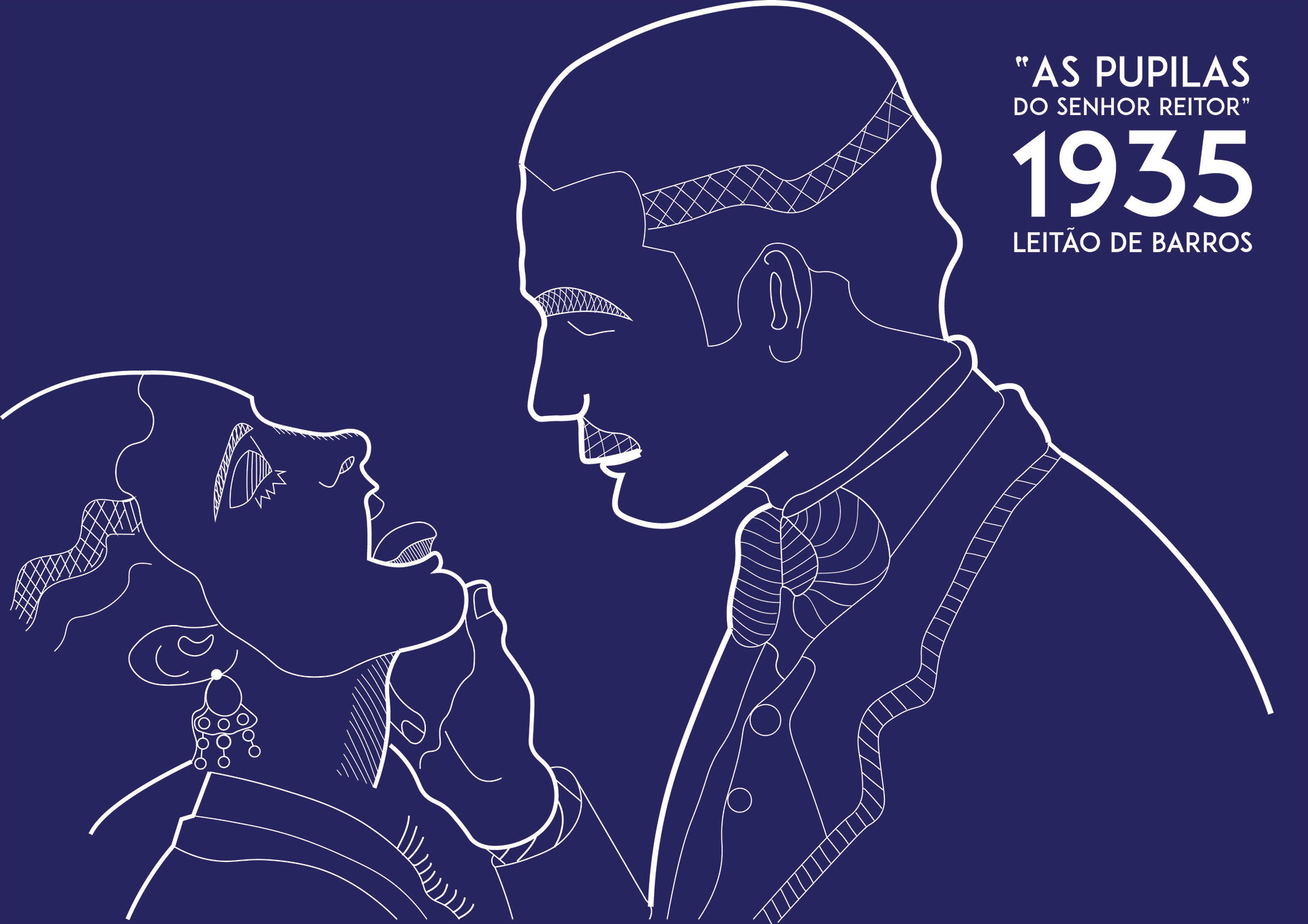
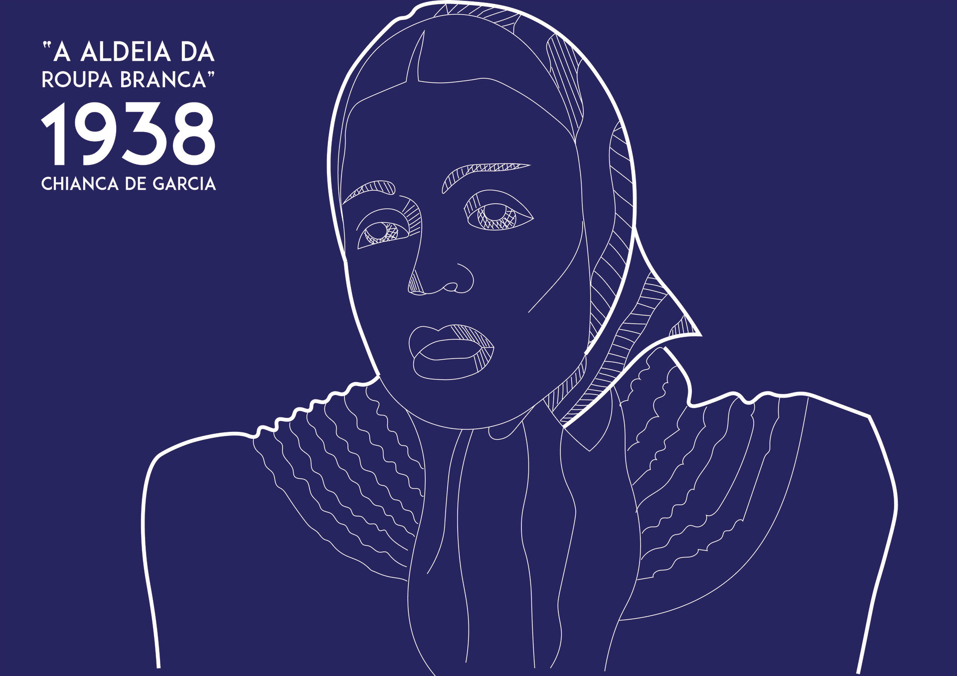
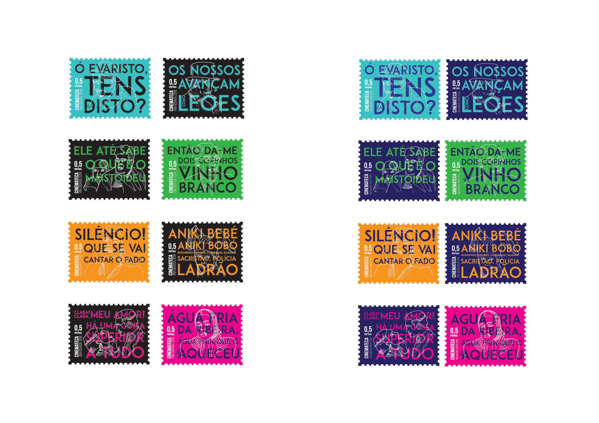
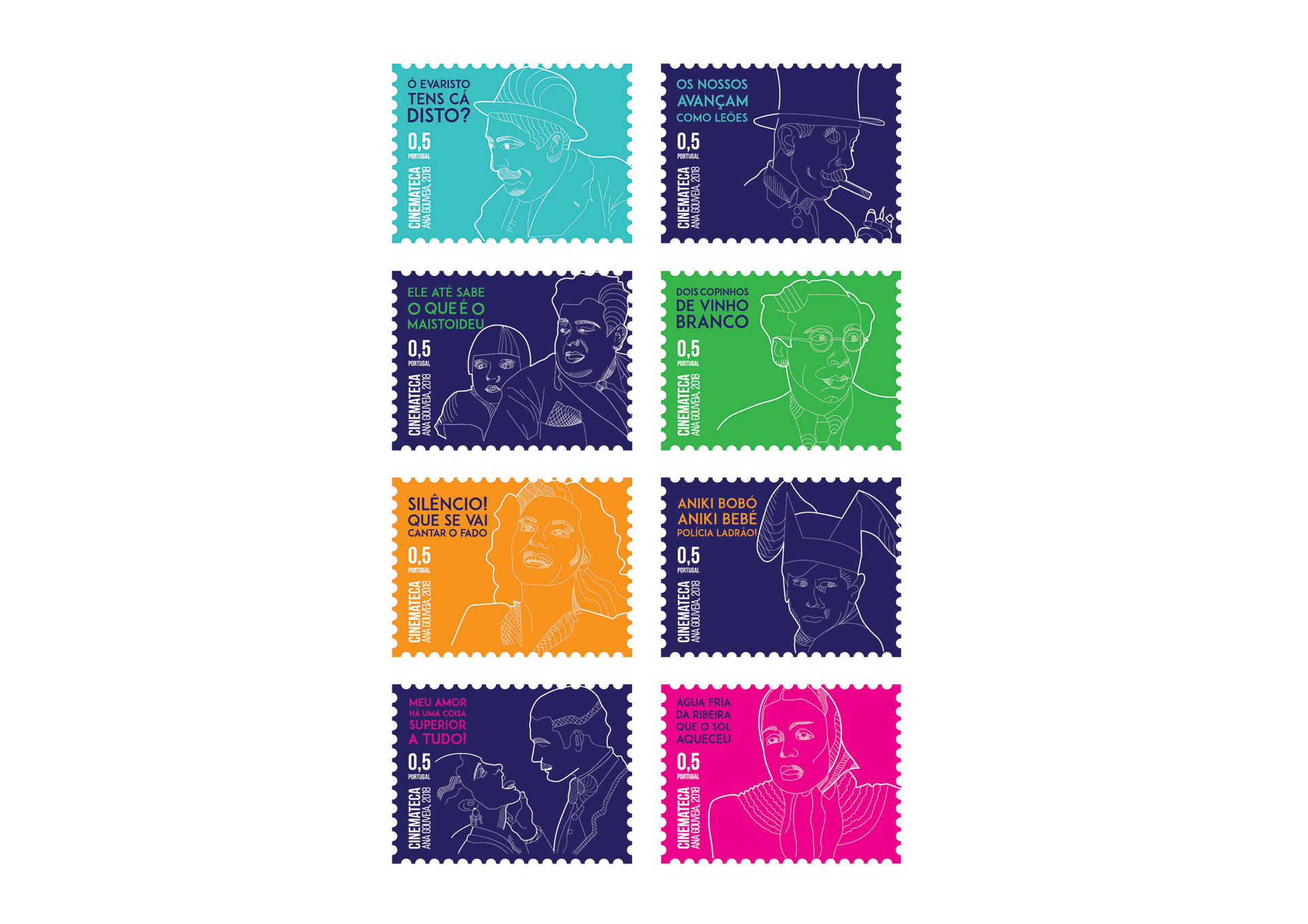
Visual-like connection to iconic movie characters + Link with key phrases of the same GOAL
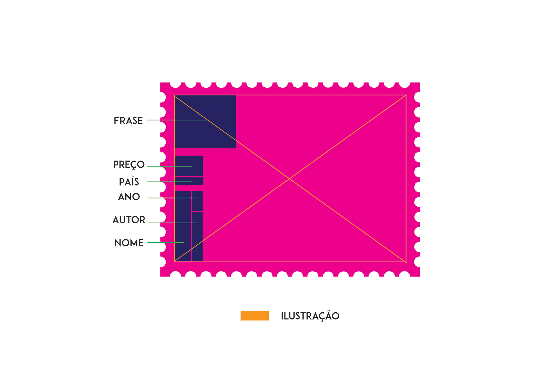
1º - observe the illustrations - line and plot
2º - observe the sentences
2º - observe the sentences
Note: Strong colors are the primary motor of attraction of the look and also of apprehension of a jovial character
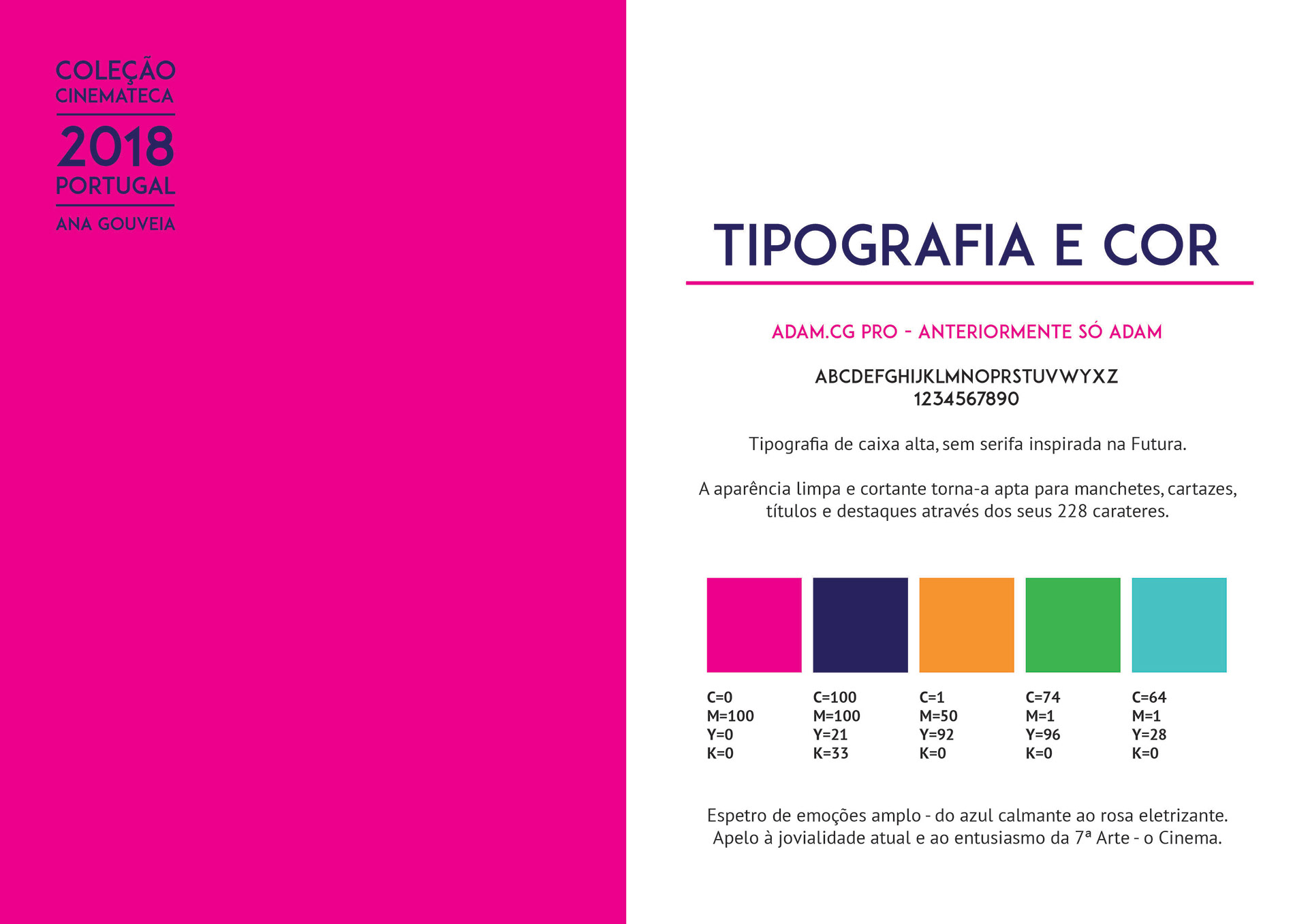
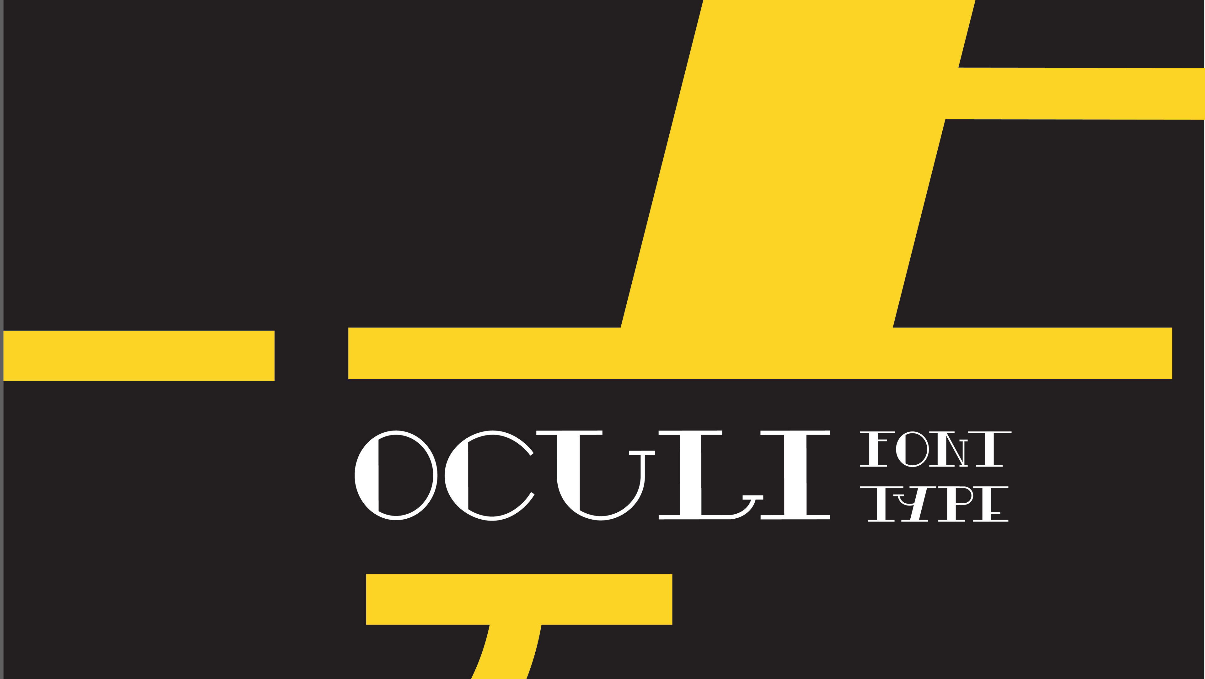
TYPE: Tall, sans-serif based typography inspired by Futura.
The clean and sharp appearance makes it fit for headlines, posters, titles and highlights through its 228 characters.
COLOR: Broad spectrum of emotions - from soothing blue to electrifying pink.
appeal to the current joviality and enthusiasm of the 7th Art - the Cinema.
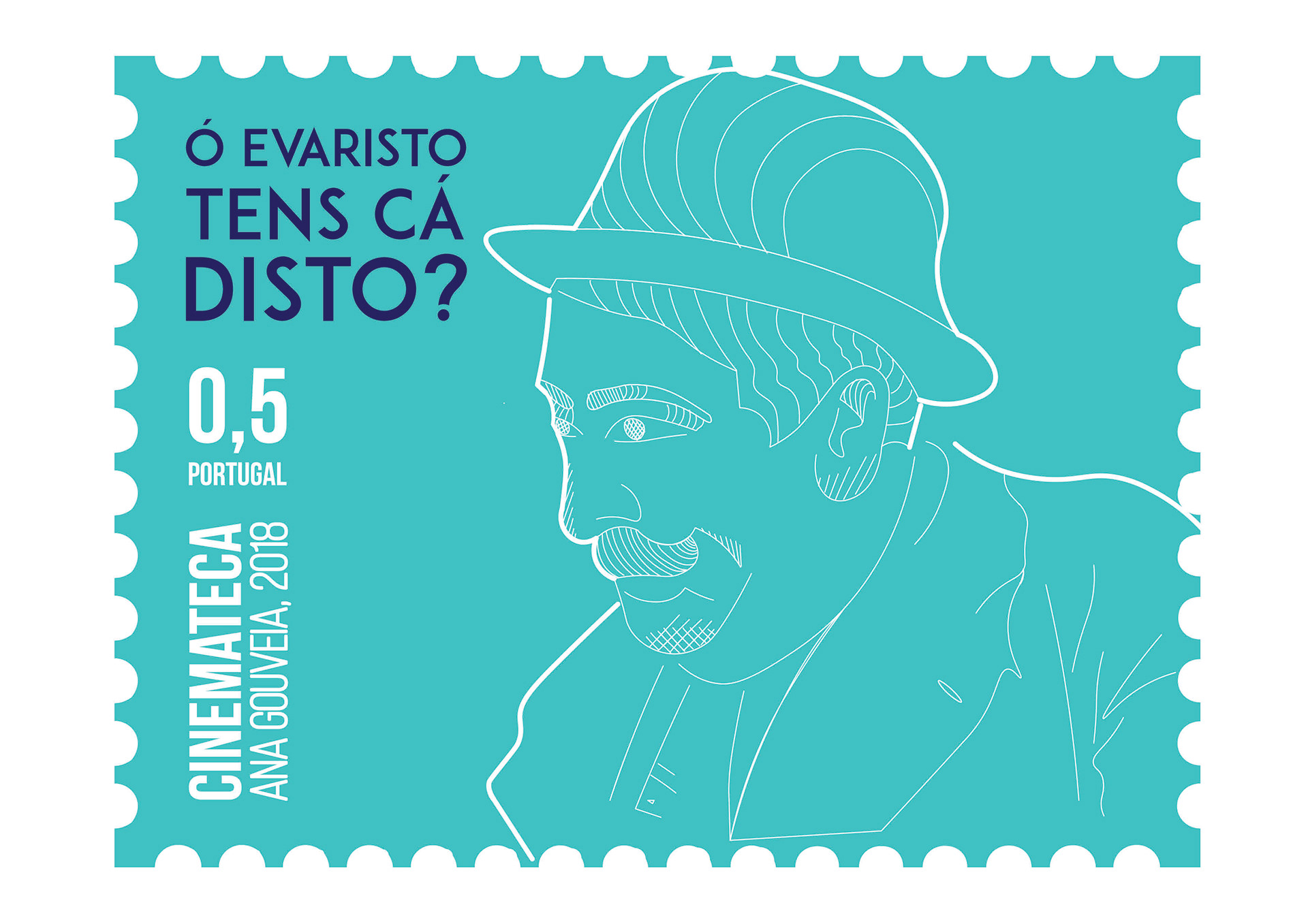
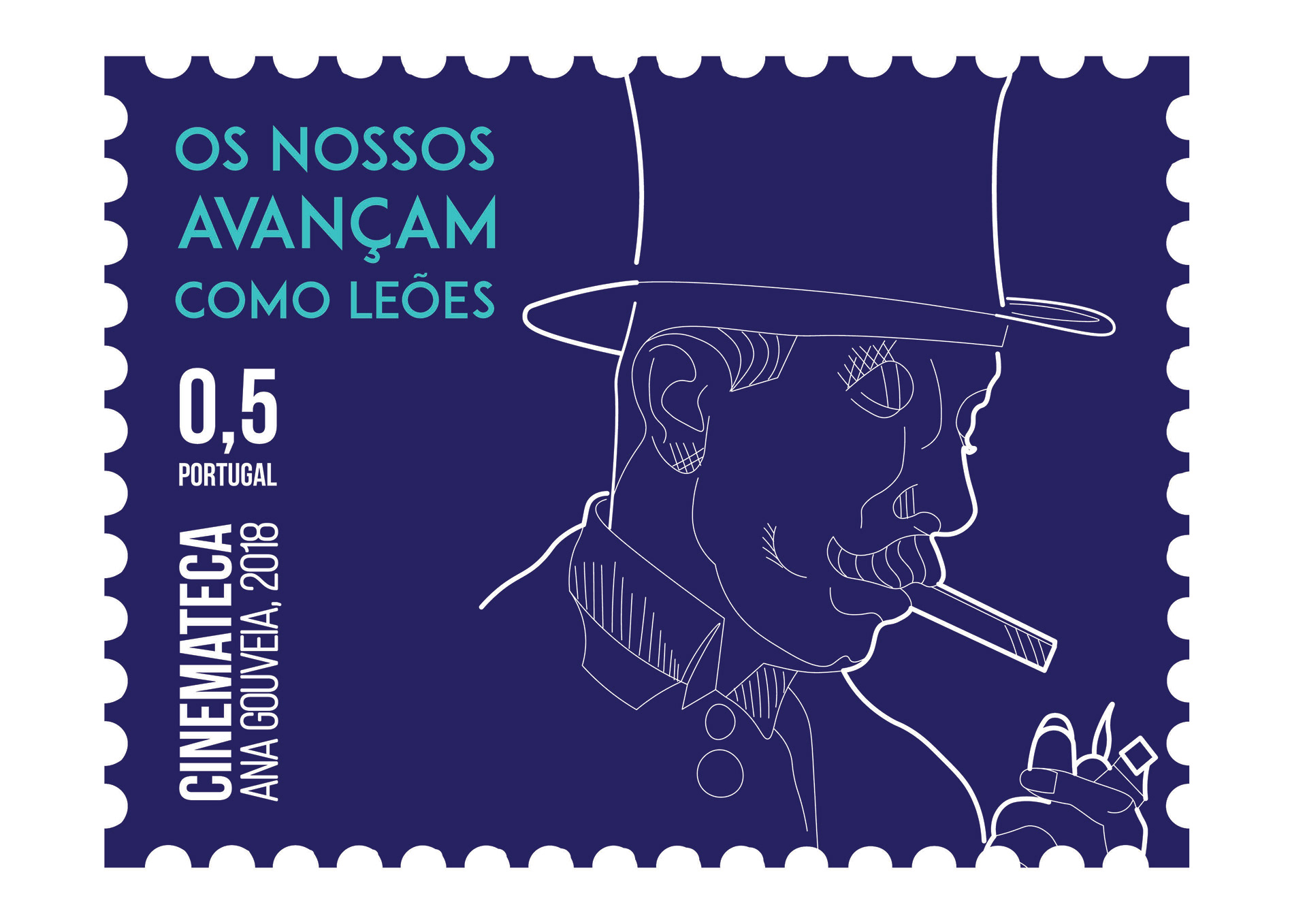
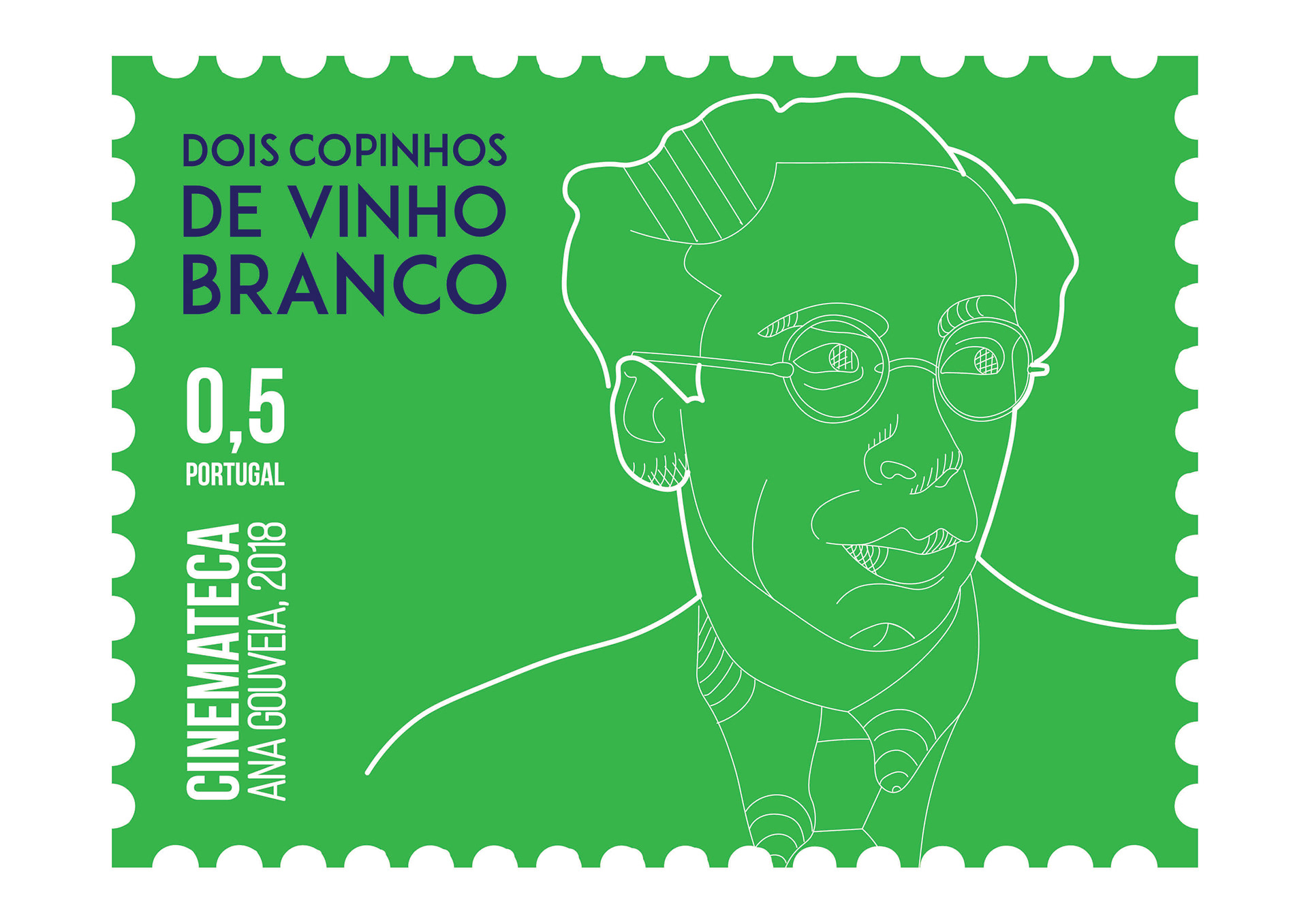
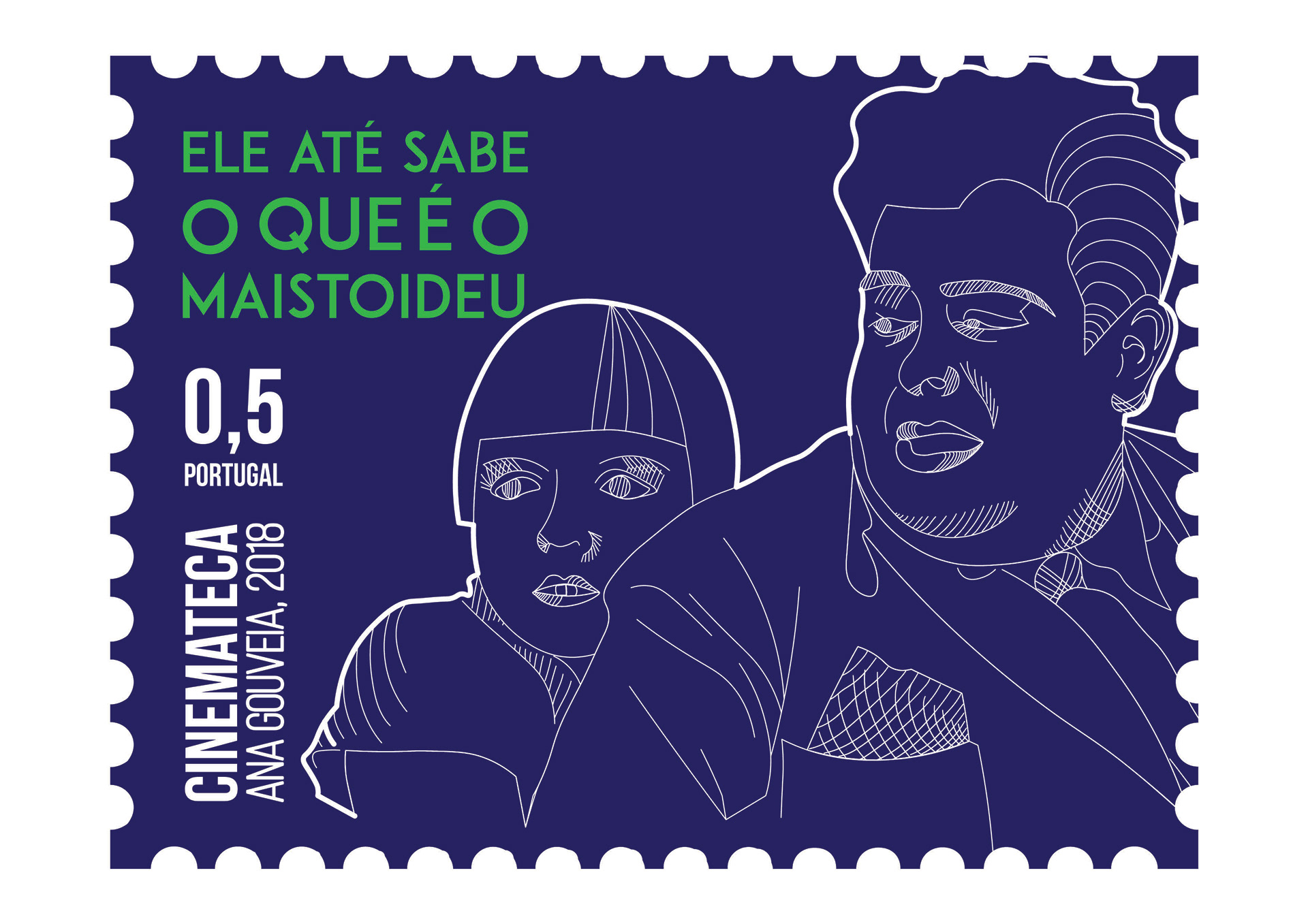

Design: Ana Raquel Gouveia
Professor: Tiago Navarro Marques
Universidade de Évora